The summer heat hasn’t slowed us down given we’ve released another great Recollective product update to all our customers. For August 2019 we created a new solution for customizing charts and their related data tables. Also, if you haven’t already done so, please read about our product updates from May and July.
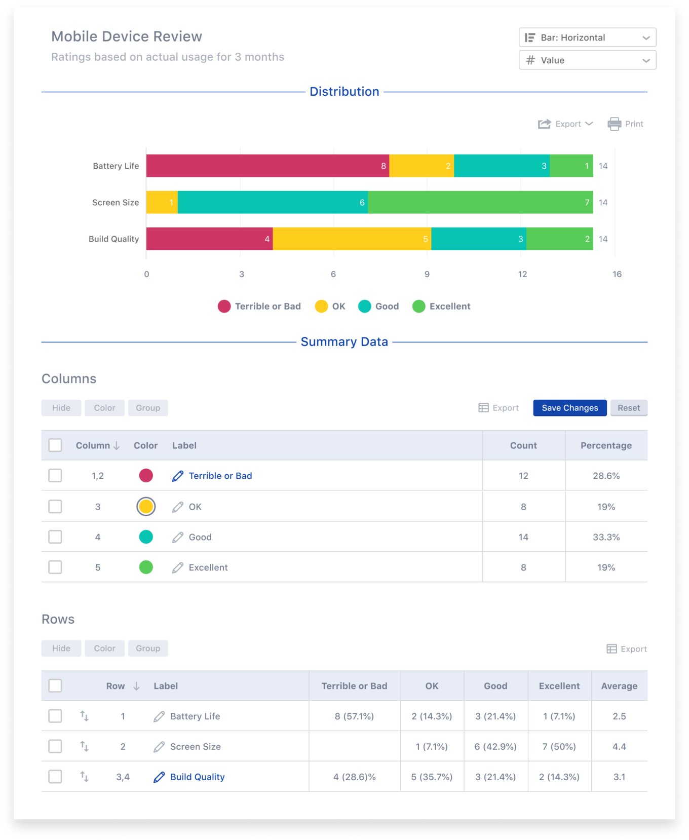
Chart customization has probably been our most requested feature enhancement for some time and that’s for a good reason. We want our researchers to spend time engaging and moderating, not rebuilding charts in Excel. When a chart doesn’t exactly meet your needs (e.g. for inclusion in a client presentation), recreating it from raw data can waste a lot of time.
Recollective now provides a fantastic amount of flexibility for nearly all the task types with a chart summary.
The new chart customizations include:
- Chart title and sub-title editing
- Chart type and orientation setting (e.g. vertical bar chart)
- Chart mode setting (data labels as values or percentages)
- Renaming, re-coloring or hiding items (e.g. choices, columns, rows, cards, groups, ratings, etc.)
- Grouping related items (data is instantly combined in the summary table and its related chart)
- Sorting dynamically or manually (e.g. by value, name, etc.)
Another key improvement in this release is also related to charts. Study administrators can now customize the default color theme for all charts in a study. Once set, a chart will cycle through the defined colors while still allowing individual color overrides to take place for each chart.
To learn more about the release, please download (and share) our Recollective Product Update: August 2019 (PDF) or keep reading to learn more.
Chart Customization
Customization controls are located between the chart and its summary data table. You effectively customize the data table to achieve a change in its related chart (e.g. sort, rename, combine, re-color, etc.). You can then choose to export the customized chart or data table. Saving the customizations allows them to be shared.
Chart Title Editing
Every chart includes a title and a sub-title for context and these two values can now be directly edited on the page. Simply click a chart title to enter an editing mode. Make your desired changes and save them. Next time you export your chart, your custom titles will be included.
Note that a saved chart title will appear to other users viewing the chart. If you have other unsaved customizations, those will be saved along with the new titles.

Chart Type Selection
All charts can be displayed as bar charts. They can be either vertical or horizontal in its orientation. A vertical orientation is ideal when there are many items included. A pie chart option will also be available in some cases. Select the desired chart type and save that choice along with any other customizations.

Data Label Appearance
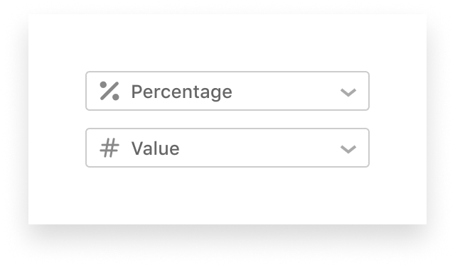
Charts include absolute values by default (e.g. number of selections for an item). If you prefer to see a percentage relative to the number of respondents, you can now enable the “Percentage” mode. This control appears to the right of the chart title. Like the chart type, the desired mode can be saved along with all other customizations.
Renaming Items
Various labels and items can appear in a chart (e.g. “Performance” and “Very Satisfied”). These labels can be customized whenever you see a pencil icon next to the label name. Simply click on the label you wish to rename and save your changes. Don’t worry, you can restore the original labels at anytime.

Edit Colors
The colors used in a chart are derived from the default chart color theme. This can now be customized for an entire study (see below for more on theme customization). You can also customize the color of an individual item on a single chart. To do so, find the desired item in the table below the chart. Select the colored circle and a color picker will appear. Choose a new color and the change will instantly be reflected in the chart.
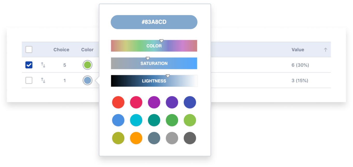
Note that you can re-color multiple items at once by selecting the items to be re-colored and pressing the “Color” button above the table.
Hide Unwanted Items
Sometimes a chart needs to be focused on the items that matter. You can now hide unwanted items by selecting one or more items in the table and selecting the “Hide” button. Hidden items will not appear in the chart or the Excel export of the data table. Percentage calculations will also be updated to exclude the hidden items.
Hidden items will be greyed-out in the data table so that they can be selected and revealed again. To unhide them, select the hidden items and a “Show” button will appear for selection.
Group Related Items
Sometimes it’s beneficial to group related items in a chart. Perhaps they are similar in meaning (e.g. “Unsatisfied” and “Very Unsatisfied”) or they have very little data and would be better grouped and shown as “Other”. In either case, simply select the items you want to group via the checkboxes in the summary table below the chart. Next, select “Group” and customize the name of the grouped items. Once items are grouped, you can continue to add more items to that group.
Groups are easy to spot as there will be multiple ID values for a single row. For example, if you group poll choices 3 and 5, the resulting row will show the grouped item as being choice “3, 5”. If you want to ungroup an item, select the checkbox next to the group and press the “Ungroup” button that will appear.
Sorting Items
To get your charted items in exactly the order you want, you now have two choices: dynamicand manual sorting.
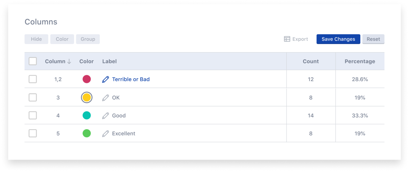
Dynamic sorting is achieved by selecting the column header in the data table below the chart. You can, for example, sort by the Count column. Select the column again to toggle between an ascending or descending sort. The related chart will instantly update to match the sort order of the data table.
Manual sorting is achieved by dragging and dropping the rows in the data table. Locate the up-and-down sorting icon on a row. Select and drag that icon up or down to re-position that item in the table. The related chart will instantly reflect the manual order you’ve set.
Saving Your Customizations
As soon as you start making customizations, a “Save Changes” button will appear. Your changes are private until you choose to save them. If you wish to have your customizations persist and be visible to everyone, select “Save Changes”. Note that all changes for a single chart will be saved at once (e.g. chart title edits, item changes, re-sorting, etc).
Resetting a Chart
Once customizations have been made, before or after they’re saved, those changes can be undone via the “Reset” control. You can reset an entire chart by pressing “Reset” and confirming the action. If you only want to reset changes made to a few items, select those items before pressing “Reset”.
Note that resetting an item will undo all its customizations at once: label changes, color changes and any groupings. Resetting the entire chart will go further by resetting the type, mode, sort and titles of the chart.
Default Chart Color Theme
Administrators interested in chart customization may not want to manually edit the color of every item in every chart. If one has a desired color theme in mind, it can now be set once for a study via Study Settings. Furthermore, Recollective now includes a new “Bright” color theme in addition to the existing “Pastel” theme.
To customize the default chart color theme for a study, select “Admin” in the main navigation bar and select “Study Settings” followed by “Appearance“.
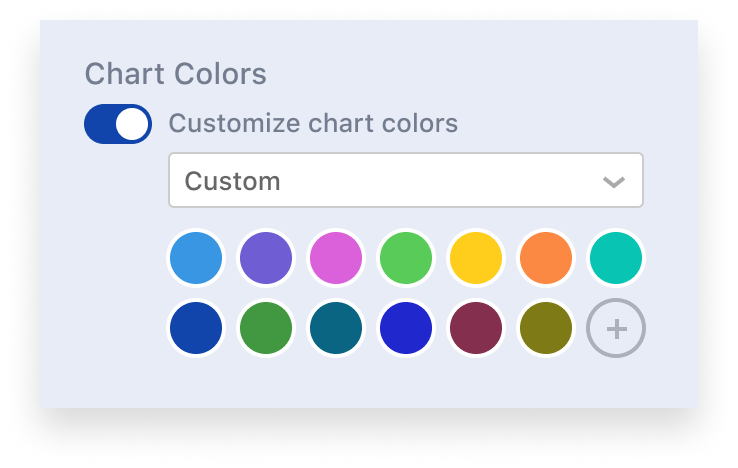
Below “Chart Colors“, enable the switch labeled “Customize chart colors“. A drop down will appear that has two choices: “Pastel” or “Bright“.
You can customize the default themes by adding, editing, sorting and removing colors. Note that a minimum of 12 colors are required and up to 36 colors can be defined.
Once saved, the colors in the customized theme will then be cycled through in the order they are configured. For example, if you have 12 colors and a chart with 14 items, the first two colors will appear again for items 13 and 14. If you want to avoid repeated colors, add more colors in the default chart theme or simply re-color the individual chart items.
Additional Improvements
As usual, this release also includes many smaller improvements to Recollective’s usability, scale and performance:
- Ability to paste values during setup of Grid tasks (columns and rows) and Sort & Rank tasks (cards and groups)
- Video Minute usage warning now appears if above 80% (usage tracking has been re-located to Subscriptions)
- Real-Time Activity: Improved charts for Polls
- Larger default size for Photo and Video task attachments
We hope you’ve been enjoying these product updates. Please send us your feedback or contact us for a personalized demonstration.



.svg)